AELi Brand Revitalization
AELi provides food waste solutions by turning waste into renewable energy. This established company with a long history lacked a strong brand design to match their impactful mission.
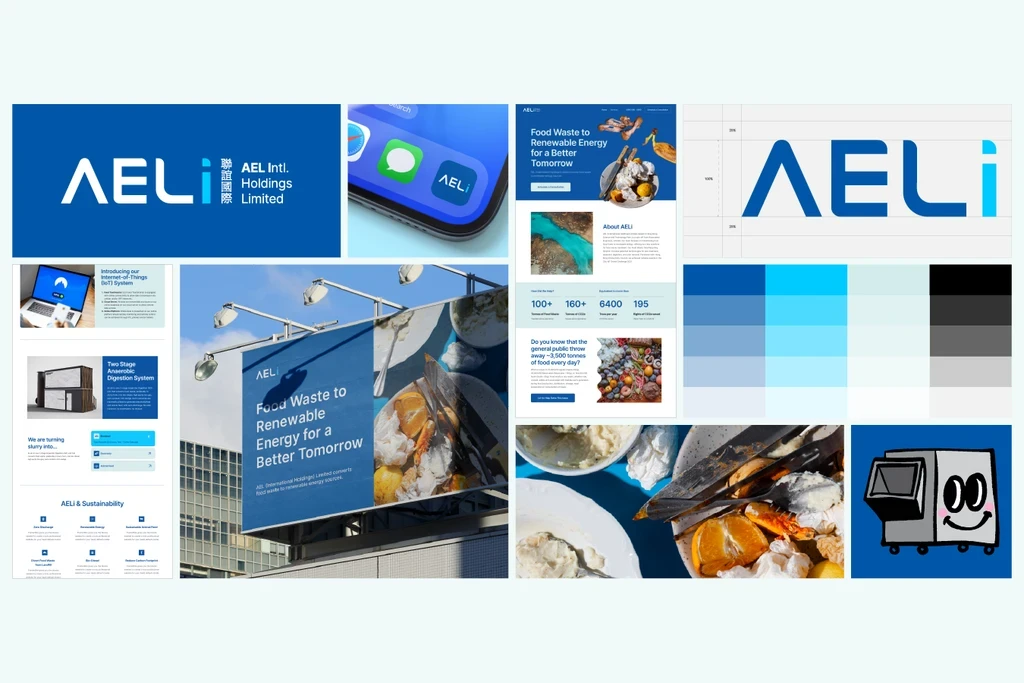
AELi had operational credibility but visual identity not reflecting their importance. We gave comprehensive revamp centered on primary blue communicating environmental responsibility and technological innovation—professional and trustworthy for B2B while suggesting clean water and sky. Rather than completely replacing their existing logo, we simplified and refined it for readability while maintaining recognizable elements. We created clean wordmark providing flexibility alongside logo symbol. Typography emphasized clarity—AELi's complex technical work needed accessible presentation. Custom illustrations explain food waste conversion in clear, engaging visual terms for education and personality. High-contrast food waste photography provides attention-grabbing marketing assets demonstrating the problem professionally. Comprehensive brand guideline with complete visual system: refined logo usage, new blue-centered color specifications, typography guidelines, custom illustration library explaining technology, photography guidelines and image library, specifications for diverse contexts from trucks to websites and investor presentations. Marketing illustrations provide flexible visual assets for various communication needs. Website design creates online presence finally matching AELi's significance, effectively communicating value proposition to commercial clients, investors, and partners while establishing thought leadership.


